Table of Contents
ToggleChoosing the right paint color for a living room isn’t just about picking a favorite shade off a fan deck. It’s about understanding how light moves through the space, how the color interacts with existing furniture and flooring, and what mood the room needs to support. A well-chosen palette can make a cramped room feel airy, a cold north-facing space feel warmer, or a bland builder-grade box feel custom and intentional. This guide covers practical living room paint ideas across warm, cool, bold, and neutral categories, with specific color recommendations and application tips that go beyond Pinterest boards.
Key Takeaways
- Living room color ideas should match the room’s natural light—warm tones for north-facing spaces, cool tones for south-facing rooms to prevent temperature imbalance.
- Test paint samples on two walls (one with direct light, one without) for 2–3 days before committing, as colors shift dramatically throughout the day.
- Warm colors like terracotta and peach make large spaces feel intimate, while cool blues and greens recede visually to make small rooms feel larger.
- Bold jewel tones and deep charcoal paint colors work best in rooms with high ceilings and good natural light, paired with contrasting white trim to prevent a cave-like feel.
- Neutral greige and soft gray remain versatile living room paint colors that transition seamlessly in open-concept homes and complement both warm and cool accent colors.
- Proper wall prep (fill holes, sand, and prime) and quality painter’s tape are essential to achieve clean, professional results and true color on light-colored walls.
How to Choose the Right Color Palette for Your Living Room
Start by assessing the room’s natural light. North-facing rooms receive cooler, bluer light throughout the day, so warm paint colors (yellows, taupes, warm grays) help balance that chill. South-facing rooms get strong, warm light, cool tones like soft blues or greens prevent the space from feeling too hot.
Consider the room’s function. A living room that doubles as a home theater benefits from darker, more saturated colors that reduce glare. A family room with kids and pets might need a color that hides scuffs, mid-tone grays and taupes are more forgiving than stark white or deep navy.
Test paint samples on at least two walls, one that gets direct light and one that doesn’t. Paint a 2×2-foot square and live with it for a few days. Colors shift dramatically between morning and evening, and what looks perfect at noon might read too dark at 7 p.m.
Account for your existing finishes. If you have honey oak trim or warm wood floors, cool grays can look dingy. Conversely, if you’ve got cool-toned tile or gray carpeting, warm beiges might clash. Match the undertone of your paint to the undertone of your largest fixed elements.
Finally, decide on sheen. Flat or matte hides wall imperfections but doesn’t wipe clean easily. Eggshell (10–25% sheen) is the sweet spot for living rooms, durable enough for everyday touch-ups, subtle enough to avoid highlighting flaws. Satin works well in high-traffic homes with kids.
Warm and Inviting Living Room Color Schemes
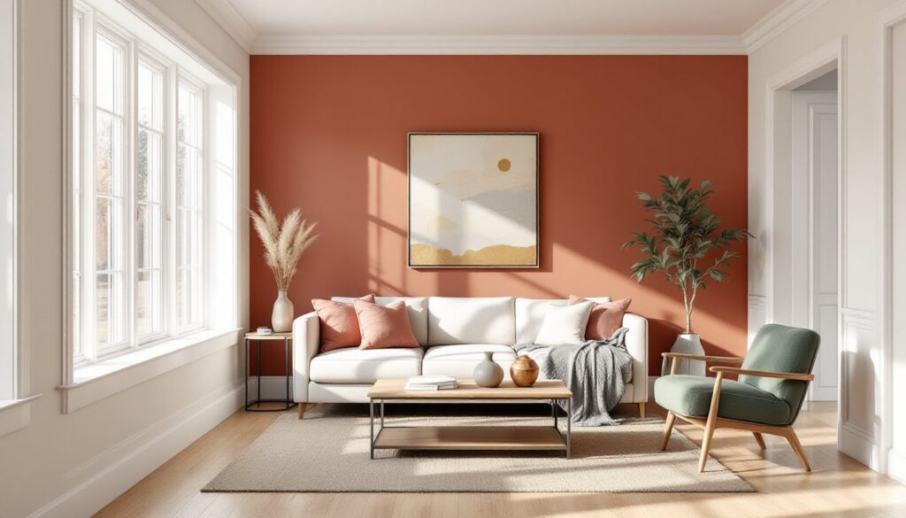
Warm paint colors for living rooms lean into reds, oranges, yellows, and their muted cousins, terracotta, rust, ochre, and warm taupe. These colors make large, open-plan spaces feel more intimate and north-facing rooms feel less cold.
Terracotta and Rust: Think SW Cavern Clay or BM Audubon Russet. These earthy tones pair well with natural wood furniture, leather, and brass fixtures. They read as sophisticated rather than trendy, and they age well. Use them on an accent wall behind a sofa or across all four walls in a room with plenty of white trim for contrast.
Warm Taupe and Greige: Colors like SW Accessible Beige or BM Revere Pewter have warm, slightly brown or beige undertones. They’re flexible, work with both modern and traditional furniture, and they don’t compete with artwork or textiles. These are go-to interior paint colors for living rooms in open-concept homes where the living room flows into the kitchen.
Soft Peach and Blush: For cozy living room paint colors that still feel light, consider muted peach tones like SW Blushing or BM Soft Sand. These work especially well in rooms with a lot of white trim and linen upholstery. They add warmth without going full-on orange.
Application tip: Warm colors advance visually, making walls feel closer. If your living room is small, use warm tones sparingly, on one accent wall or below a chair rail, and keep the ceiling and opposite walls a crisp white or soft cream.
Cool and Calming Color Ideas for Relaxing Spaces
Cool colors, blues, greens, and cool grays, recede visually, making rooms feel larger and more open. They’re ideal for south- or west-facing living rooms that get intense afternoon sun, and they create a calming backdrop for minimalist or coastal interiors.
Soft Blue-Grays: Colors like SW Passive or BM Stonington Gray have a slight blue undertone that reads as serene without feeling cold. They’re excellent wall paint colors for living rooms with lots of white millwork. Pair them with warm wood accents and brass or gold fixtures to keep the space from feeling sterile.
Sage and Olive Green: Muted greens, think SW Clary Sage or BM Saybrook Sage, are having a moment and for good reason. They bring an organic, calming quality without the clinical feel of gray. These tones work well with natural fiber rugs, linen, and wood furniture. They’re also forgiving in rooms that get inconsistent light.
True Blue: For a bolder cool tone, consider a medium-depth blue like SW Naval or BM Hale Navy on a single accent wall. This creates a focal point without overwhelming the space. Interior designers often recommend pairing these with crisp white trim and warm metallics like copper or aged brass.
Cool Charcoal: Deep charcoal grays, like BM Chelsea Gray or SW Peppercorn, work as modern colors for living room spaces that want a moody, gallery-like feel. These are best used in rooms with ample natural light and paired with light-colored furniture and plenty of white or cream to prevent the space from feeling like a cave.
Pro tip: Cool colors can sometimes read as flat or dull in low-light conditions. If your living room lacks natural light, choose a cool tone with a hint of warmth in the undertone, or add warm-temperature LED bulbs (2700K–3000K) to balance the palette.
Bold and Dramatic Living Room Colors That Make a Statement
Bold paint color ideas for living room spaces aren’t for the faint of heart, but when done right, they create unforgettable interiors. These work best in rooms with high ceilings, good natural light, or intentionally moody, intimate spaces.
Deep Jewel Tones: Emerald green (SW Alexandrite or BM Deep Royal), sapphire blue, and amethyst purple make walls feel like a feature in themselves. These saturated colors work best when paired with high-contrast trim, bright white or even black, and metallic accents like gold or brass. They’re especially effective in formal living rooms or spaces anchored by stylish fireplace decor that draws the eye.
Charcoal and True Black: Painting all four walls in a near-black or deep charcoal (BM Black Satin, SW Tricorn Black) can make a room feel like a sophisticated lounge. This approach requires commitment: use high-quality paint (two coats minimum), ensure trim and ceilings are a contrasting color, and layer in plenty of warm lighting. According to designers at House Beautiful, darker tones can actually make small rooms feel cozier rather than smaller, as long as there’s enough contrast and light.
Burnt Orange and Deep Terracotta: For a bold warm option, colors like SW Copper Mountain or BM Sedona Clay bring energy without feeling garish. These are modern paint colors for living room spaces influenced by Southwestern or mid-century design. Pair them with natural wood, cream upholstery, and woven textures.
Safety note: When painting large areas in deep, saturated colors, proper ventilation is critical. Wear a respirator rated for organic vapors, especially with oil-based or low-VOC paints that still off-gas. Open windows and use box fans to create cross-ventilation.
Neutral Living Room Palettes with Timeless Appeal
Neutral living room paint ideas remain the most popular choice for a reason: they’re flexible, they age well, and they let furniture and art take center stage. But “neutral” doesn’t mean boring or builder-grade beige.
Warm Whites and Creams: Colors like BM White Dove, SW Alabaster, or BM Swiss Coffee have just enough warmth to avoid the sterile feel of pure white. They’re the best paint colors for living rooms with lots of natural light and open floor plans. Pair them with natural wood tones and layered textures, linen, jute, wool, to add depth.
Greige: The gray-beige hybrid remains a workhorse for interior living room paint ideas. SW Agreeable Gray and BM Revere Pewter are two of the most versatile options. They work with both warm and cool accent colors, and they transition seamlessly between rooms in an open layout. These tones are ideal for homeowners who want a neutral backdrop that won’t compete with changing decor trends.
Soft Gray: True grays with minimal undertones, like SW Repose Gray or BM Stonington Gray, are best for modern or industrial interiors. They pair well with black metal fixtures, concrete, and cool-toned tile. Be cautious with these in rooms that get little natural light: they can read as flat or even dingy without enough brightness.
Off-White with Subtle Undertones: For a slightly warmer alternative to stark white, consider colors like BM Cloud White or SW Snowbound. These have just a whisper of warmth or coolness depending on the light, making them adaptable to various living room color schemes.
Pro tip: Neutrals are only as good as the prep work behind them. Fill all nail holes and sand smooth, imperfections show up more on light-colored walls. Prime with a high-quality primer like BM Fresh Start or Zinsser 123 to ensure even coverage and true color.
How to Use Accent Colors and Two-Tone Combinations
Accent walls and two-tone combinations let homeowners experiment with bolder living room wall paint ideas without committing to an all-over color.
Choosing an Accent Wall: The best candidates are walls with architectural interest, a fireplace wall, a wall with built-in shelving, or the wall behind the main seating area. Avoid accenting a wall with windows: the color gets broken up and loses impact. Paint the accent wall in a color 2–3 shades deeper than the other walls, or choose a completely contrasting hue.
Two-Tone Horizontal Splits: Painting the lower two-thirds of a wall in a darker color and the upper third in a lighter shade (or vice versa) adds visual interest and can make ceilings feel higher. This works especially well in rooms with chair rail or picture rail molding. Use a laser level and painter’s tape to ensure a clean, straight line. Paint the lighter color first, let it dry fully, then tape and paint the darker color.
Color-Blocked Accent Shapes: For a modern twist on living room wall paint ideas, some designers are painting geometric shapes or asymmetrical blocks of color. This requires careful planning and taping, but it’s a low-cost way to add a custom, artistic element. Stick to two or three colors maximum to avoid visual chaos.
Ceiling Color: Don’t overlook the fifth wall. Painting the ceiling a shade darker than the walls (or even a bold accent color) can make a room with high ceilings feel more intimate. This technique is popular in home styling guides on MyDomaine and other design-forward resources.
Trim and Molding: Contrasting trim color can make a huge difference. Bright white trim against colored walls creates crisp definition. Black or charcoal trim against neutral walls reads as modern and architectural. If you’re painting trim, use a semi-gloss or high-gloss finish for durability and easy cleaning. Sand lightly between coats for a smooth finish.
Tool tip: For clean lines at the ceiling and along trim, invest in a quality angled sash brush (2-inch or 2.5-inch) and use Frog Tape or 3M ScotchBlue painter’s tape. Press the tape edge firmly with a putty knife to prevent bleed-through.
Conclusion
The best living room paint colors are the ones that solve a problem, whether that’s adding warmth to a cold room, making a small space feel larger, or creating a dramatic focal point. Test samples in your actual light conditions, prep your walls properly, and don’t skip the primer. Paint is one of the most cost-effective ways to transform a space, but it only works if the execution matches the vision. For more inspiration and detailed design ideas, check out resources like Decoist to see how color choices integrate with broader interior design trends.