Table of Contents
ToggleBlue and grey might sound like a safe, even predictable combo, but that’s exactly why it works. This palette gives you a rock-solid foundation without locking you into a single mood or style. Whether you’re aiming for coastal calm, urban sophistication, or something in between, blue and grey adapt. They’re forgiving enough for DIY paint jobs, versatile enough to work with existing furniture, and neutral enough that you won’t get tired of them in two years. This guide walks through practical ways to layer these colors in your living room, from choosing the right shades to balancing furniture, walls, and accessories without turning the space into a monotone snoozefest.
Key Takeaways
- Blue and grey living room ideas work because these cool-toned colors complement each other without clashing, with grey acting as a neutral anchor and blue adding personality and depth.
- Test paint colors on at least two walls for several days before committing, as lighting conditions dramatically affect how shades appear throughout the day and season.
- Navy and charcoal create sophisticated, moody spaces in larger rooms but require lighter textiles and warm-toned accents to prevent the space from feeling cave-like.
- Soft blues and light greys create an airy, calming retreat perfect for smaller living rooms and coastal styles, though north-facing rooms need warm accents to avoid feeling sterile.
- Layer blue and grey through furniture, textiles, and accessories—like navy sofas with light grey curtains or patterned pillows combining both colors—to add visual interest without overwhelming the space.
- Incorporate natural elements such as wood furniture, jute rugs, and potted plants to balance the cool blue and grey palette and prevent the room from feeling cold or clinical.
Why Blue and Grey Make the Perfect Living Room Color Palette
Blue and grey share a cool undertone, which means they sit comfortably side by side without clashing or competing. Grey acts as the visual anchor, it’s neutral enough to ground a room but doesn’t fade into the background like beige can. Blue brings personality and depth, whether it’s a soft sky blue or a saturated navy.
From a practical standpoint, this combo is forgiving. If you’re repainting over builder-grade beige or updating a rental, grey covers well in two coats with a quality primer like Zinsser Bulls Eye 1-2-3. Blue accents, whether on furniture, trim, or an accent wall, add contrast without requiring a full room repaint. That’s a real advantage if you’re doing the work yourself on a weekend.
The psychological effect matters too. Interior design experts note that cooler tones like blue reduce visual noise and help spaces feel larger, which is useful in smaller living rooms or homes with open floor plans. Grey tempers blue’s intensity, so you get the calming effect without the room feeling cold or sterile. Together, they create a balanced environment that works for both relaxation and entertaining.
Choosing the Right Shades of Blue and Grey for Your Living Room
The wrong shade can turn your living room into a cave or a sterile waiting room. Natural light is the deciding factor here. South-facing rooms with strong daylight can handle deeper tones: north-facing rooms need lighter shades to avoid looking dingy.
Test samples on at least two walls, one that gets direct light and one that doesn’t. Paint a 2′ x 2′ section and live with it for a few days. Colors shift dramatically between morning and evening, and what looks like a soft grey in the store can read purple or green under your specific lighting. Use sample pots (usually 8 oz) rather than relying on paint chips, which are too small to judge accurately.
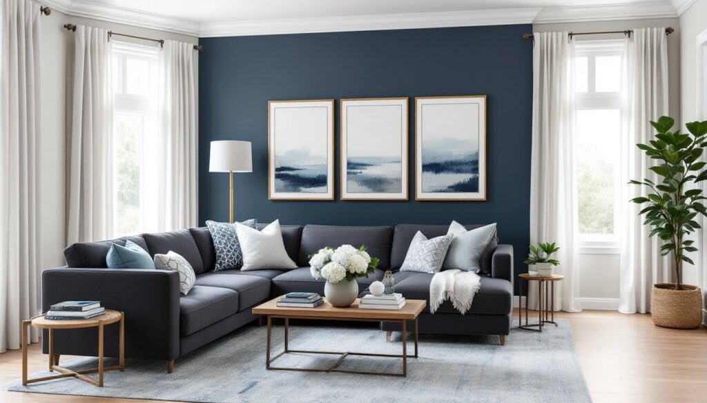
Navy and Charcoal for a Bold, Dramatic Look
Navy blue and charcoal grey create a sophisticated, almost moody atmosphere. This pairing works well in larger living rooms or spaces with high ceilings, where darker tones won’t overwhelm. Navy and grey living room ideas often feature one dominant dark wall (like the wall behind a sofa or entertainment center) with charcoal accents in furniture or curtains.
If you’re painting walls in navy or charcoal, budget for three coats. Dark colors require more coverage to avoid streaking, and you’ll want a high-quality paint with good hide, look for products with a volume solids content above 35%. Sherwin-Williams Tricorn Black and Benjamin Moore Hale Navy are reliable options that don’t need constant touch-ups.
Balance is critical. Use lighter textiles (cream, off-white, or pale grey throws and pillows) to prevent the room from feeling like a cave. Add warm-toned wood furniture or brass fixtures to offset the cool palette. Without these contrasts, navy blue and grey living room ideas can feel heavy and uninviting.
Soft Blues and Light Greys for a Calming Retreat
Soft blues (think powder blue, sky blue, or aqua) paired with light greys create an airy, restful space. This approach suits smaller living rooms, coastal or farmhouse styles, and anyone who wants a low-stress environment. Grey and blue living room ideas in lighter tones reflect more light, making spaces feel larger.
For walls, consider a light grey like Benjamin Moore Stonington Grey or Sherwin-Williams Repose Grey as your base. Add soft blue through upholstery, curtains, or a single accent wall. If you’re working with existing furniture, this is the easier route, light greys are more forgiving and won’t clash with warm wood tones or existing neutrals.
One caution: light greys with blue undertones can look cold in rooms with little natural light. If your living room faces north or has small windows, add warm accents (wood, brass, or terracotta) to keep the space from feeling sterile. Recent design trends lean into layering textures, linen, wool, and natural fiber rugs, to add warmth without introducing competing colors.
Furniture and Upholstery Ideas in Blue and Grey Tones
Furniture is where you can commit to color without the permanence of paint. A grey sectional or navy sofa anchors the room and gives you flexibility to swap out smaller accents as trends change. Look for performance fabrics if you have kids or pets, materials like Crypton or Sunbrella resist stains and hold up to daily wear.
If you’re starting with neutral furniture, add blue through accent chairs, ottomans, or dining chairs in an open-concept space. A pair of navy wingback chairs or a grey tufted bench introduces the palette without overwhelming the room. Mix finishes, pairing a velvet blue chair with a linen grey sofa adds visual interest and prevents the space from feeling flat.
Wood tones matter. Darker woods (walnut, espresso) pair well with navy and charcoal: lighter woods (oak, maple) complement soft blues and pale greys. If your coffee table or media console is a warm honey tone, stick with lighter shades of blue and grey to avoid a jarring contrast.
For DIYers considering reupholstery, it’s more work than it looks. A standard sofa requires 12-16 yards of fabric, and unless you’re experienced with a staple gun and padding, you’re better off hiring an upholsterer or buying slipcovers. Custom slipcovers from companies like Comfort Works run $300-$600 but give you a cleaner result than a DIY first attempt.
Accent Walls, Paint, and Wallpaper Combinations
An accent wall is the easiest way to introduce bold color without committing the entire room. Choose the wall that naturally draws the eye, typically the one behind the sofa, the fireplace wall, or the wall opposite the main entry.
If you’re painting, prep matters more than the paint itself. Fill nail holes with spackling compound, sand smooth with 120-grit sandpaper, and prime any patches. Skipping this step leaves visible dimples and uneven sheen. Use painter’s tape (FrogTape works well on textured walls) and remove it while the paint is still slightly tacky to avoid peeling.
Wallpaper adds texture and pattern, which flat paint can’t deliver. Peel-and-stick options from brands like Tempaper or RoomMates are DIY-friendly and removable, making them suitable for renters. Look for geometric patterns, subtle stripes, or textured designs that incorporate both blue and grey. A navy geometric wallpaper on one wall paired with light grey on the remaining three creates dimension without overwhelming the space.
If you’re working with existing grey walls and want to add blue, consider a chair rail or picture frame molding painted in a contrasting blue. This adds architectural interest and breaks up large expanses of wall. Install the molding with a miter saw for clean 45-degree corners, secure with finishing nails, fill nail holes, caulk seams, then paint. It’s a weekend project that looks custom.
Incorporating thoughtful use of color can completely shift a room’s mood, especially when layered with varying textures and finishes.
Accessorizing Your Blue and Grey Living Room
Accessories tie the palette together and give you flexibility to shift the look seasonally without repainting. Start with textiles, throw pillows, blankets, and curtains are the easiest swaps. Layer different shades: a charcoal pillow next to a powder blue one, anchored by a patterned option that pulls in both colors.
Curtains frame the room and control light. If your walls are light grey, navy or slate blue curtains add depth. If you’ve gone bold with dark walls, stick with light grey or white curtains to balance. Hang curtain rods close to the ceiling and let panels skim the floor, this makes ceilings look higher and windows larger. Use a stud finder to locate solid anchor points: drywall anchors alone won’t hold heavy drapes.
Rugs ground the seating area and define zones in open layouts. A grey area rug with blue accents works in most setups. Size matters, your rug should be large enough that at least the front legs of your sofa and chairs sit on it. An 8′ x 10′ rug fits most standard living rooms: measure your space before buying.
Artwork and decor bring in personality. Blue and grey abstract prints, coastal photography, or botanical prints in blue frames reinforce the palette. For a cohesive look, choose frames in matching finishes, matte black, brushed nickel, or natural wood, rather than mixing metals haphazardly.
Lighting is often overlooked but crucial. Warm-toned bulbs (2700K-3000K) soften cool palettes and prevent the room from feeling clinical. Add table lamps with grey linen shades or floor lamps with brass or black finishes to layer light. Dimmer switches give you control and cost under $20 to install if you’re comfortable working with basic wiring (turn off the breaker first).
Finally, bring in natural elements. A jute rug, driftwood bowl, or potted fiddle-leaf fig adds warmth and texture. Blue and grey can feel cold without organic materials to balance them out. Even a simple wooden tray on your coffee table breaks up the cool tones and makes the space feel lived-in rather than staged.