Table of Contents
ToggleNeutral living rooms aren’t about playing it safe, they’re about building a foundation that works with your life, not against it. Whether you’re planning a full refresh or tweaking an existing space, neutrals offer flexibility that bold color schemes can’t match. You can swap out accessories, shift styles, and update the room’s mood without repainting or reupholstering everything. But “neutral” doesn’t mean boring. Done right, a neutral living room balances warmth, texture, and intentional design choices that create a space people actually want to spend time in. This guide walks through the practical decisions, color selection, material layering, furniture choices, that turn a beige box into a room with presence.
Key Takeaways
- Neutral living room ideas succeed because they create a flexible foundation that adapts to your lifestyle, allowing you to swap accessories and update style without committing to major renovations like repainting.
- Test paint samples in your actual space at different times of day, as warm neutrals (beige, taupe, cream) and cool grays read differently depending on lighting conditions and adjacent materials like wood trim.
- Texture is essential in neutral living rooms—layer different weaves in upholstery, rugs, textiles, and wall treatments to prevent a flat, sterile appearance and add visual depth.
- Invest in durable, cleanable performance fabrics for frequently used seating, choose furniture with clean lines and classic silhouettes to ensure longevity, and avoid matching sets in favor of mixed wood tones and materials.
- Natural materials like hardwood flooring, stone accents, natural fiber rugs, and wood furniture ground a neutral palette and prevent it from feeling cold or impersonal.
- In neutral living rooms, personality shines through intentional accent pieces—artwork, layered lighting with warm-white bulbs, seasonal textiles, and mirrors—rather than bold color choices.
Why Neutral Living Rooms Are Always in Style
Neutral palettes work because they don’t fight for attention. Whites, grays, beiges, taupes, and soft earth tones recede just enough to let furniture, architecture, and natural light shape the room’s character.
From a resale perspective, neutrals appeal to the widest range of buyers. Real estate agents consistently recommend them for staging because they don’t impose taste, they suggest possibility. But even if you’re not selling, neutrals make it easier to rotate decor seasonally or shift styles without committing to a full repaint.
Neutrals also photograph well, which matters if you’re documenting a DIY renovation or listing your home. They don’t skew color balance in photos the way saturated walls can, and they work under various lighting conditions, north-facing rooms with cool daylight or south-facing spaces flooded with warm sun.
Finally, neutral backgrounds let you invest in statement pieces, an heirloom rug, a sculptural coffee table, or a gallery wall, without visual competition. The room becomes a curated space rather than a color story.
Choosing Your Neutral Color Palette
Not all neutrals are created equal. Beige, greige (gray-beige hybrid), warm whites, and cool grays each carry different undertones that shift depending on light and adjacent materials.
Test paint samples in your actual room. Paint 2’×2′ squares on at least two walls, one that gets direct sunlight and one that doesn’t. Observe them at different times of day. A warm beige can look peachy in morning light and muddy at dusk. A cool gray might read blue-toned in north light.
For a warm neutral living room, lean toward colors with beige, taupe, or cream bases. Sherwin-Williams Accessible Beige (SW 7036), Benjamin Moore Revere Pewter (HC-172), and Farrow & Ball Elephant’s Breath (No. 229) are popular warm neutrals that adapt well to various lighting.
For a modern neutral living room, cooler grays and whites create a crisper backdrop. Consider Benjamin Moore Stonington Gray (HC-170) or Sherwin-Williams Repose Gray (SW 7015). Pair these with black or charcoal accents for contrast.
Don’t paint every wall the same shade. Use a lighter neutral on the ceiling (often a white with the same undertone as your wall color) to maintain height, and consider a slightly deeper shade on one accent wall or trim to add subtle dimension.
Woodwork and trim matter. If you’re keeping existing trim, choose wall colors that complement rather than clash with the wood tone. Cool grays can look sterile next to warm oak trim: a greige bridges the gap better.
Layering Textures for Visual Interest
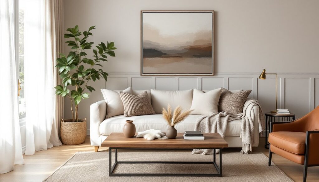
A neutral room without texture is a waiting room. Texture is what separates a thoughtfully designed space from a flat one, and it’s non-negotiable in neutral living room decor.
Start with large surfaces: upholstery, rugs, and window treatments. A linen sofa has a different hand than velvet or leather, and each reads differently against a wool or jute rug. Layering a cowhide or sheepskin over a larger area rug adds both texture and warmth.
Textiles are the easiest texture layer to control. Use a mix of weaves and weights: a chunky knit throw, smooth cotton pillows, a nubby boucle accent chair. Avoid matching everything, uniformity kills dimension. If your sofa is smooth leather, add linen or wool pillows. If it’s a textured weave, balance it with sleeker materials elsewhere.
Wall treatments add another texture layer. Shiplap, board-and-batten wainscoting, or a textured plaster finish (like Venetian plaster or limewash) catch light differently than flat paint. These aren’t purely cosmetic, they change how the room feels physically and visually. Installing board-and-batten is a manageable DIY project using 1×4 or 1×6 boards (actual dimensions 3/4″×3.5″ or 3/4″×5.5″) spaced evenly and painted the same color as the wall for a subtle grid.
Hard surfaces count too. A raw-edge wood coffee table, a stone fireplace surround, or a metal light fixture each contribute tactile variety. Mix matte and gloss finishes, matte walls with a satin-finish trim, matte ceramic vases next to polished brass hardware.
Furniture Selection for a Neutral Living Room
Furniture in a neutral room should anchor the space without dominating it. Scale, proportion, and material choice matter more than color.
Sofas and seating: Choose upholstery in durable, cleanable fabrics if the room gets daily use. Performance fabrics like Crypton or solution-dyed acrylics resist stains and fading without looking synthetic. Linen is beautiful but wrinkles and stains easily, fine for a formal living room, less practical for a family space.
Stick to furniture with clean lines and classic silhouettes if you want longevity. A track-arm sofa or a simple rolled-arm design won’t look dated in five years. Overstuffed sectionals and heavily tufted pieces can date quickly and dominate a neutral room.
Coffee tables and side tables: Wood tones warm up neutral palettes. Look for pieces in walnut, oak, or reclaimed wood with visible grain. A live-edge table adds organic shape without color. Glass or acrylic tables keep sightlines open in smaller rooms.
Avoid matching furniture sets. A mix of wood tones, metal finishes, and materials looks intentional rather than showroom. Pair a wood coffee table with metal side tables, or a leather sofa with a linen armchair.
Scale furniture to the room. A 90″ sectional overwhelms a 12’×14′ living room: a 72″ sofa and two accent chairs provide better balance and flexibility. Measure doorways and hallways before buying, getting a sectional wedged in a doorframe is a common and avoidable mistake.
Adding Warmth with Natural Materials
Natural materials ground a neutral room and prevent it from feeling sterile. Wood, stone, fiber, and metal each bring distinct qualities.
Wood is the easiest warmth lever. Exposed ceiling beams, hardwood or engineered wood floors, wood furniture, or even a wood-framed mirror add instant warmth. If you’re installing new flooring, consider 3/4″ solid hardwood in white oak or walnut, or 5/8″ engineered wood with a wear layer of at least 2mm for refinishing flexibility. Sand and finish in place for a custom look, or use prefinished planks to save time and mess.
Stone and concrete add weight and texture. A limestone or travertine fireplace surround, a concrete coffee table, or a slate accent wall introduce cool-toned minerality that balances warm woods. These materials are heavy, confirm floor load capacity if adding a large stone feature, especially on upper floors.
Natural fiber rugs, jute, sisal, seagrass, are affordable and durable but can feel scratchy underfoot. Layer a softer wool or cotton rug over sisal if you want the look without the texture. Jute rugs shed initially and stain easily: treat them with a fiber protector if using in high-traffic areas.
Indoor plants bridge stylish fireplace decor and living room accents effectively. A fiddle-leaf fig or monstera in a ceramic or woven basket planter adds life and vertical interest. If natural light is limited, consider low-light plants like pothos or snake plants.
Metal accents, brass, blackened steel, brushed nickel, add reflective contrast. Use them sparingly: a brass floor lamp, an iron curtain rod, or steel shelf brackets. Avoid mixing too many metal finishes in one room: stick to two or three for cohesion.
Accent Pieces That Elevate the Space
Accents are where personality shows up. In a neutral room, they don’t need to scream, they just need intention.
Artwork provides color and focal points without commitment. A large-scale piece over the sofa or fireplace anchors the room. Frame prints in simple wood or metal frames: avoid ornate gilding unless your style skews traditional. Gallery walls work well in neutral rooms, mix frame styles and sizes but keep mats and spacing consistent for a clean look.
Lighting is both functional and decorative. Overhead lighting alone flattens a room: add table lamps, floor lamps, and sconces to create layers. Use warm-white LED bulbs (2700K–3000K) to maintain warmth in a neutral palette. Dimmers are worth the $15-$30 per switch, they let you adjust mood and compensate for changing daylight.
Throw pillows and blankets are the fastest way to refresh a room. Swap them seasonally, linen and cotton in summer, wool and velvet in winter. Stick to a mix of solids and subtle patterns (stripes, geometric, or organic prints) rather than bold graphics. Oversize pillows (24″×24″ or larger) look more intentional than standard 18″ squares.
Books and objects add lived-in character. Stack art books on the coffee table, display ceramics or sculptural objects on shelves, or group candles in varying heights. Avoid clutter, edit ruthlessly and leave negative space.
Mirrors reflect light and expand visual space. A large leaning mirror (common sizes are 36″×48″ or larger) propped against a wall adds drama without installation. Hang mirrors opposite windows to bounce natural light deeper into the room.
Conclusion
A neutral living room isn’t a compromise, it’s a framework. It lets you build a space that adapts as your needs and tastes shift without requiring a gut renovation every few years. Focus on quality materials, intentional texture, and proportional furniture, and the room will hold up visually and functionally. Neutrals don’t date themselves the way trends do, and that’s the point.